Pie Charts
Slices of a whole
Where does your screen time actually go — games, videos, messaging, music? How does a whole
class vote for a school trip, or a monthly budget get spent? These are all questions about
how one whole thing divides up between its parts, and a pie chart shows exactly that at a
glance.
A pie chart takes a whole amount of data and splits it into
slices of a circle — one slice for each category. The
whole circle stands for the total, and each slice shows
how big a share of that total its category has. So a pie chart answers the
question "how is the whole shared out?" at a single glance.
The golden rule is simple: a bigger slice means a bigger share. The largest
slice is the most popular category; the smallest slice is the least popular. You don't even
need numbers to read that — your eye does it for you.
Because the whole circle is the total, the slices always fill the circle exactly,
with no gaps and no overlaps. Add every slice together and you get back the whole.
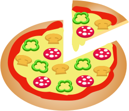
Cut a pizza into slices and you have made a pie chart of the pizza. If you cut it into
four equal slices, each slice is a quarter of the whole
pizza — a quarter of the circle, a quarter of 360^\circ, which is
90^\circ. Eat one slice and three-quarters of the circle is left.
A pie chart works the same way: the slices share out the whole, exactly like slices of a pizza
share out the dinner.
Reading a pie chart
You can learn a lot from a pie chart without doing any sums at all. Just look at the slices:
- Which is biggest? The widest slice is the most common category.
- Which is smallest? The narrowest slice is the least common.
-
Roughly what fraction? If a slice fills half the circle,
that category is about half of the whole. A slice that is a quarter of the
circle (a right-angle corner) is about a quarter of the whole. A thin sliver is a tiny part.
Spotting "about a half" or "about a quarter" by eye is the most useful pie-chart skill there is —
a half is a straight line across the middle, and a quarter is one square corner of the circle.
How wide is a slice?
To draw a pie chart exactly, we need the angle of each slice. The whole
circle is 360^\circ, so a slice's angle is its share of the total,
taken out of 360^\circ:
\text{slice angle} = \frac{\text{frequency}}{\text{total}} \times 360^\circ
Worked example 1. 20 people chose a drink and 10 of them chose tea. Tea's
share is \frac{10}{20} = \tfrac12, so its slice is
\frac{10}{20} \times 360^\circ = 180^\circ — exactly half the circle.
Worked example 2. 30 children name a favourite sport: football 15, swimming 10,
running 5. Each angle is its frequency out of 30, times 360^\circ:
- football: \frac{15}{30} \times 360^\circ = 180^\circ (half the circle),
- swimming: \frac{10}{30} \times 360^\circ = 120^\circ (a third),
- running: \frac{5}{30} \times 360^\circ = 60^\circ (a sixth).
Check it: 180^\circ + 120^\circ + 60^\circ = 360^\circ — the slices
fill the whole circle, just as they should.
Worked example 3 (reading backwards). You can run the rule the other way to turn
an angle back into a count. With a total of 24 pupils, a slice of
90^\circ is
\frac{90^\circ}{360^\circ} \times 24 = 6 pupils.
-
the whole circle is 360^\circ and represents
the total;
-
each slice's angle is
\dfrac{\text{frequency}}{\text{total}} \times 360^\circ;
-
to read a slice back, its frequency is
\dfrac{\text{slice angle}}{360^\circ} \times \text{total};
-
all the slice angles add up to
360^\circ.
A pie chart shows proportions, not raw counts. A slice tells you what
share of its own pie the category has — never how many things there are.
-
A big slice in a small pie can be fewer than a small slice in a big pie.
Half of a class of 10 is just 5 pupils, but a thin tenth of a school of 600 is 60 pupils —
the small slice is more children. You cannot compare two pies by eye unless you know each total.
-
The slices of one pie always add to the whole, so their angles add to
360^\circ. If yours don't, a slice is wrong.
Think of how you spend a whole day — all 24 hours — as one pie. Sleep about
8 hours and that slice is
\frac{8}{24} \times 360^\circ = 120^\circ, a third of the circle.
School for 6 hours is
\frac{6}{24} \times 360^\circ = 90^\circ, a quarter. Whatever is
left — playing, eating, travelling — fills the rest of the circle, because the slices of your
day always add back up to one whole day.
Build a pie chart
Twenty people picked a drink: 10 chose tea, 5 chose coffee and 5 chose juice. Step through to
draw the three slices, then label each angle.
A fresh pie every time
Here is a pie chart of a few random categories. Each slice is labelled with its
angle — its share of the 360^\circ. Notice how the
biggest slice always has the biggest angle, and how the angles add up to the whole circle. Press
Refresh for a brand-new pie.