Bar Charts and Pictograms
Picturing frequencies
Which fruit does your class like best? Which colour of car passes the school gate most often?
Survey results like these turn up everywhere — on classroom posters, in science projects, in
newspapers — and they are almost always shown as a bar chart or a pictogram rather than a plain
list of numbers.
A frequency table
is a list of numbers — how many children like each fruit, how many cars passed each colour. A
chart turns those numbers into a picture you can read at a glance:
you can spot the biggest, the smallest, and the gaps without doing any sums.
A bar chart draws each category as a bar. Every bar is the
same width with a gap between it and the next, and its
height — read off the labelled axis — gives that category's
frequency. The rule is simple: taller bar, bigger count. The
tallest bar is the most common category; the shortest is the least common.
A pictogram uses a picture instead of a bar. A key
tells you how many each picture is worth — for example
\text{🙂} = 5 — so three pictures mean
3 \times 5 = 15. A part-picture (half a face, say)
shows a part of that number, so half a symbol here would mean
2.5.
The table has every exact number, but your eyes have to read and compare them one by one. A
chart does the comparing for you: the tallest bar simply looks tallest, so
"which is most popular?" is answered in a single glance. That is the whole point of a chart —
it trades a little exactness for a lot of speed.
Reading a bar chart
Step through this one: first the frequency axis with its ticks, then a bar for each of four
categories A, B, C, D — heights 3,
5, 8 and 4.
Worked example. Reading off the chart above:
- The most common category is C — its bar is the
tallest, reaching 8.
- The least common is A, reaching only
3.
- C beats A by
8 - 3 = 5.
- The total frequency is
3 + 5 + 8 + 4 = 20.
To read any bar, slide your finger from its top straight across to the axis and
read the number there. If the top sits between two ticks, count the small squares to land on the
exact value.
Pictograms: one picture, many things
A pictogram swaps bars for pictures. Because drawing 30 pizzas would take forever, one picture
usually stands for several items — and the key tells you how many. To read a row
you multiply the number of pictures by the key, then add on any part-picture.
Worked example. A shop records pizzas sold, with the key
\text{🍕} = 10:
- Monday shows 3 pictures, so
3 \times 10 = 30 pizzas.
- Tuesday shows 2\tfrac12 pictures, so
2.5 \times 10 = 25 pizzas.
- Monday beat Tuesday by 30 - 25 = 5 pizzas, and together they sold
30 + 25 = 55.
A class voted for their favourite pet. Here each picture stands for
2 children (that's the key). Count the pictures in a row,
then double it.
Cat
 = 8
= 8
Dog
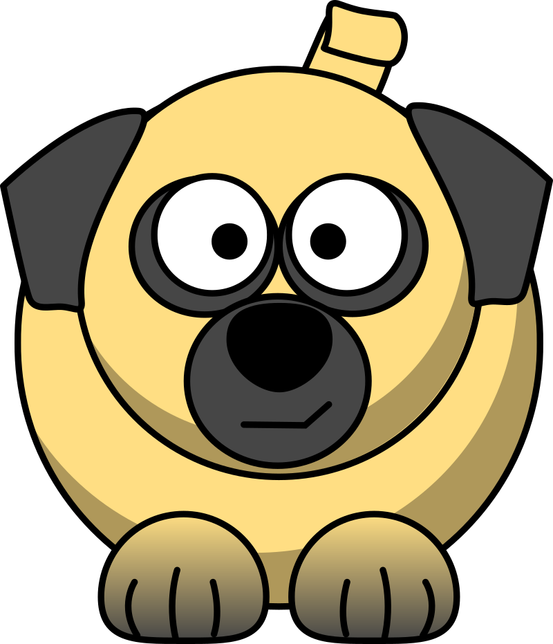 = 6
= 6
Duck
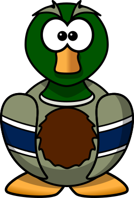 = 10
= 10
Fish
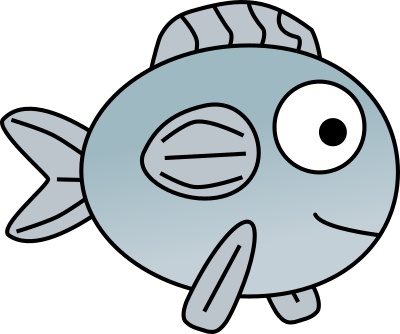 = 4
= 4
The duck row is longest, so ducks are the most popular with
5 \times 2 = 10 votes. Altogether
8 + 6 + 10 + 4 = 28 children voted.
Cookies eaten at the party, with the key \text{🍪} = 4. Notice the
last picture in the Tuesday row is only half a cookie — a part-picture worth
half of 4, which is 2.
Mon
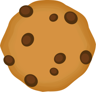 = 12
= 12
Tue
= 10
Tuesday is 2 \times 4 + 2 = 10 cookies — two whole pictures plus the
half. A part-picture is the pictogram's clever way of showing a number that is not a neat
multiple of the key.
Watch the scale, watch the key
Most mistakes with charts are not sums gone wrong — they are misreadings. Two traps
catch nearly everyone:
-
On a pictogram, always read the key first. The same row of
three pictures means 15 when
\text{🙂} = 5 but only 6 when
\text{🙂} = 2. One picture is almost never one thing.
-
On a bar chart, read the bar's top against the axis, not
how tall it "looks". If the ticks go up in 2s (or
5s, or 10s), a bar one square above the
6 tick is 7, not 6.
-
Don't forget a part-picture: half a symbol adds half the key, not nothing.
- On a bar chart, each bar's height = the frequency, read
from the labelled axis.
- Bars all have equal width with gaps between them — that's
what separates a bar chart from a histogram.
- On a pictogram, the key says how many each symbol is
worth; part-symbols show parts of that number.
Try it: a chart that changes
Here is a fresh survey of four fruits, with the votes counted up the labelled
axis. Read each bar's height off the scale, find the tallest bar (the most
popular fruit) and the shortest, and try totalling all four. Press
Refresh for a brand-new survey.
See it explained